Massive Study on Headache Statistics
Just how common are headache disorders? This is an extremely difficult question, in spite of the statistics that are thrown around as if they’re certain.
A new study out of Norway, published in The Journal of Headache and Pain, is giving us a new way to look at headaches and migraine from a global perspective.
Researchers took 357 publications, not just adding up the numbers, but looking carefully at how the study was done, to come up with some new estimates for 1961-2020.
Age & Gender
Here is just a sample of the findings of the study. First, 52% of the global population has suffered from a headache disorder of some kind this past year. Here’s what that looks like:
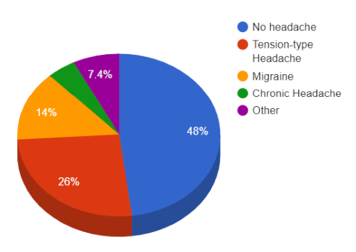
What I call “chronic headache” here is defined as a headache more than 15 days a month (H15+ in the study).
In agreement with many other studies, headaches are more common in women than in men. The difference is significant, if not huge, until you get to migraine. In migraine, about twice as many women had migraine than men (which means of course that we should ignore men’s migraine). Another interesting migraine fact was that, unlike many other headache disorders, it does tend to be lower if you’re under the age of 10 or over 65.
Geography
The study also looked at geographical location. A possible limitation of the study was that most of the research has been done in wealthier countries. However, from what this study could tell, Southeast Asia, East Asia and Oceania was the best place to be, with lowest headache prevalence.
Headache is generally more common in the North Africa/Middle East region. Migraine, however, was most common in South Asia, as was chronic headache. Tension-type headache peaked in high income countries.
Headache today?
Do you have a headache today? On any given day, about 15.8% of the world population have a headache of some kind. Almost half of these – 7%, are migraine.
Progress through the years?
There hasn’t been a huge change overall in the prevalence of headache over the past few decades, which is not particularly encouraging. But there’s worse news. Migraine actually seems to be increasing.
Why would that be? Is it just that we are more aware of migraine, and so are diagnosing it more often? Or are there environmental factors (technology, pollution, change of diet, et cetera) that are making a difference?
The researchers did discuss this question, extensively. As with all of these statistics, in spite of careful research, it is very difficult to say with certainty exactly what the numbers are. But thanks to a lot of hard work, we do have some clues to help us more forward, and keep fighting back against headache. We still have a long way to go.
For more, you can read the abstract and the complete study here: The global prevalence of headache: an update, with analysis of the influences of methodological factors on prevalence estimates
A quicker summary can be found in ScienceDaily: Global estimates of headaches suggest disorder impacts over 50 percent of the population
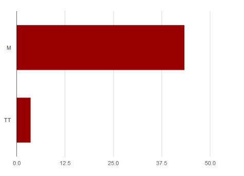 As you can see, migraine is generally significantly more disabling than tension-type headache (no surprise there). Here’s what the numbers mean – during an attack, someone with migraine loses 43.4% of their health on average (I know, at times during many attacks it’s much higher – remember, this is an average). For tension-type headache, patients lose 3.7% of their health.